Marketing Communications Plan for a Photography Studio

Introduction

All types of companies require some sort of selling practice that will promote the company’s product or service and announce them to the potential group of customers. The Photography Studio business, which provides both products and services, is no exception. However, careful considerations must be made in order to successfully sell the product and all services provided to the right kind of customer.

What is Marketing?

Marketing is a business process in which a company, whether it is a for-profit company or a non-for-profit organization, handles its interactions with its customers and crafts those interactions into lucrative ones, both for the organization itself and for its customers. In this process the companies build worth for their customers, and develop sturdy interactions with them that create profits for the company in the end. Marketing involves attracting new customers, developing those sturdy interactions with the customers, keeping them, and growing them. Marketing is not limited only to actual products sold; it is also applied to services.

The Photography Studio

The Photography Studio is a business that provides both a product and services, thus making it a bit more complicated than most businesses out there. The Photography Studio will be a brand new locally owned and operated business that provides local customers with products such as photography prints and photography equipment. The Photography Studio will also provide customers with photographic services such as studio photography, on location photography, photography editing and so forth.

Photo Studios and the Marketing Environment Forces

In every business and every type of company there are different outside elements that affect that company’s marketing department’s power to attract prospect clients, keep them, grow them and maintain a good relationship with them. All these elements and forces make what is called the marketing environment. In order to successfully maintain those customers and relationships, marketers must identify the elements that most affect their type of business and adapt their activities in order to prevail over such outside elements and challenges. The photography studio business is no exception to this rule, and they too have a marketing environment forces that affect their companies.

Competitors. Type the words “photo studio” into any search engine on the web and you will find more than 70,000,000 results, and probably more than 5 in your immediate local area. Almost all companies have to deal with competitors. You may think that companies only compete with lower prices, but this is not true. Companies must provide customers with a valuable product or service that gives customer a higher satisfaction than the competition. Nowadays more and more photographers are opening their own private small businesses, so larger companies must also compete for talent. Photo studios not only compete against each other, but also against increasing high quality of photo software that places professional editing capabilities at customers’ fingertips, sometimes even for free, and who can beat that price? Nowadays, the creation of new digital cameras with more automatic options and easier to use than ever, anyone can become a self-proclaimed professional photographer by just reading a manual, making for dozens of photographers who compete for wedding and senior photography customers everyday. Which brings us to our next challenge and marketing environment factor: technology.

Technological Environment. As new technology develops each year, products become obsolete, but also new products give way to new opportunities, new products and services, and opens up new markets. A long time ago starting a photography business would cost you $20,000 for only the initial equipment you needed, now anyone who can afford a $600 camera can have a shot at the photography business. Moreover, new developments in technology, such as new software capabilities and digital imaging enables customers to edit their own photos, scan them, copy them and reproduce them using at-home software and hardware such as printers. Printers nowadays can be connected to your point-and-shoot cameras and print all your photos at the touch of a button. These new technologies act also as competitors for photo studios, because the more customers can do themselves at home, the less they need the photo studio’s services. Not to mention that with the widespread use of the Internet images are easily copied and more and more people are involved in copyright infringement.

Economic Environment. You might think that economic trends affect all types of businesses, but some may be more affected than others. If the economy is good in general, then the customers will have a stronger buying power and higher spending patterns, and the opposite will be true for a bad economy. For example, if businesses are doing well they will probably have enough money to spend in advertising, which includes photography services. However, during a bad economy, the costs of advertising are usually the first to be cut back.

Target Market and Positioning of the Photo Studio

Once the Photography Studio has identified the segments it whishes to serve, it can analyze each of those segments’ appeal and select one or more market segments to serve. The Photography Studio business will have a market segmentation based on the geographical location to where the business will operate. It will also have a market segmentation based on social class, serving those customers who belong to the middle class, all the way to the upper uppers class. It will also have a market segmentation based on family life cycle, including young seniors at local high schools, singles who are engaged and about to be married, and married couples with children on the way or who already have children. Also, considering these are all special occasions, we can establish a target for behavioral variables such as special occasions like graduations, engagements, weddings, maternity, birth, holidays, and so forth.

The company will be located in a part of town where higher income families live and work, therefore targeting a specific geographical location as well as social class, which can be considered micromarketing and local marketing. The company will use a differentiated or segmented marketing in which it will create different offers for each of the family life cycles it will target. This will be the most profitable option for the company, because it will target clients located in a good neighborhood or area, clients who can afford professional photography services and clients who need photographic services to capture the special moments in their family life cycle, or special occasions.

There are plenty of photography studios out there, how can the Photography Studio business differentiate itself from other competitors? The Studio would remain competitive in regards to pricing, but would offer additional or better services. The studio would offer additional services like in-house hair, makeup and wardrobe consultations for portrait shots; the ability to immediately select and view all the shots taken and decide which ones to print and purchase; on location photography, in different locations other than the studio; the ability to view and share your portraits and experience through the company’s website; the ability to schedule, view, edit, print, share and store all your photographs on your mobile device with a unique application provided by the company; and finally extra photographic services for all photographic needs such as photo shoots, editing, special effects, restoring, printing photos, greeting cards, canvas, framing, enlargements, photo books, calendars, mugs, mouse pads, photo DVDs and videos, passport photos, and much more.

The Photography Studio positioning strategy would be a “More for More” strategy. The Studio would offer much, much more services than any other competitor out there, but it would have to charge more also for all the extra services. The Studio would offer the best quality products and the largest range of products for extra, but the prices would not exceed the customer’s capability to afford them.

The Photography Studio’s position statement would be as follows: For your busy family planning for the most important events of your lives and when you need to capture these special moments to keep and share forever, our Photo Studio is a one-stop photography solution spot for all your photographic needs where you can look your best, pick the best shots, be captured everywhere and anywhere, share the shots with anyone and take them with you wherever you go.

Photography Studios: Shopping Product with Great Product Features

The photography studio business falls under the Shopping Products category. People usually purchase photographic services less frequently than other products, like convenience products. When people purchase photographic services, they will usually compare prices, quality, speed, and style. People who consider purchasing photographic services will usually investigate and compare all the characteristics of each business to select the best one for them.

The marketing considerations that need to be made for the Photography Studio, based on its classification under Shopping Products are very simple. If prospect clients are out there comparing and contrasting all the Photo Studios in the area to select the best one, then the Photo Studio must provide deals and offers that appeal to those customers comparing each business. Marketers of photography services have to provide strong offers and deals in selected outlets, not just everywhere, but where it matters.

The most important decisions to be made in developing a Photography Studio Business compared to other competitors will be in the areas of Product and Service Attributes. More specifically, the Photography Studio would concentrate in providing exceptional Product Features. The best way to compete with other businesses is to be the first of those businesses to offer a new feature. The Photography Studio in question will offer plenty of new, improved and added features to all photographic services that it will make them the first choice for prospect clients.

The Photo Studio and the Pricing Dilemma

There are three main areas that will affect the pricing strategy of the Photo Studio’s products and services. These main areas are the customer’s perception of the value, the product cost and other internal and external considerations. The customer’s perception of the value of the products and services that the Photo Studio offers is what will determine the highest prices that the Photo Studio could charge for such products and services. This means that whatever amount the customers perceives as too much for the product or service that they are receiving then that is the amount art the very top that the Photo Studio should charge below of, otherwise, the customers will not purchase the service.  The product cost is all the combined expenses that the Photo Studio needs to spend in order to provide a product or service. The Photo Studio should not charge below this amount. For example, if the photo studio hires a photographer to take pictures at a high school graduation, and then all the images are printed and provided to the class on a CD, then the Photo Studio must calculate the amount they are spending on the photographer’s services, the printing cost and the cost of the CD, and they should charge the high-school more than this amount.

But these are not the only areas that the Photo Studio should consider when setting prices. The Studio should also consider external factors like competitor’s prices for example. Because clients may chose the competition over the Photo Studio, if their prices are set too high, and the competition is offering the same service and quality. The Photo Studio should also consider their previously decided target market and positioning.  Since the target market for this Photo Studio was higher income families, then the prices could be higher than the competitor’s. Since the positioning for this Photo Studio was a “More for More” strategy, then the prices would definitely be higher than the competition.

This particular Photo Studio is targeted to higher income families; therefore it makes sense to use a pricing method that would be on the higher end of the pricing curves. This Photo Studio will use the value-base pricing method to set prices for the products and services that they offer. Price setting will begin by understanding the prospect customers’ needs and value perceptions, what are they paying and what are they receiving from competitors. A price then is set that matches the customer’s perceived value. Then costs that can be incurred must be determined and finally the products that will deliver the value at the target price must be designed.

More specifically the Photo Studio in question will use the value-added pricing method. Since the positioning is one of “More-for-More”, then the Photo Studio will create value-added features to the products and services it offers to differentiate it from the competitors and sustain the higher prices.

Distribution Channels

In a Photo Studio that offers a one-stop for all photographic needs, then the customer should feel no need for other intermediaries in the process of receiving their products and services from the Photo Studio. Therefore, this company will sell directly to the consumer.

Since the Photo Studio will implement a direct marketing channel, there will only be two members in the channel, the Photo Studio and the final consumer. This could be considered exclusive distribution, because only the Photo Studio, and perhaps any franchise owners and other locations of the store would have the right to distribute the company’s products and services. The Photo Studio will employ their own sales representatives, their own photographers in studio and on location, they will be prepared with all equipment necessary to manage, print and edit all images for the customers. Therefore, there will be no need for any other intermediary or member of the channel.

The channel organization of the direct marketing channel is pretty simple, because it only involves the Photo Studio and the final customer. However, the Photo Studio could engage in several other channel organizations. A good example would be to create a horizontal marketing system with companies that provide yearbook creations to local high schools. In such channel organization, the Photo Studio could join forces with a local printing company who provides such services and be the main photography studio to provide photography services to high schools that need to take pictures to include in their yearbooks.

Another option could be to partake in a multichannel distribution system in which the Photo Studio can create or develop more marketing channels to reach other customer segments. For example, the company could create on marketing channel for all high school potential customers, another marketing channel for all wedding customers, and yet another channel for maternity and birth customers. This will enable the company to further specify the different options, offers and services that they can provide for each customer segment.

The Marketing Communications Mix of the Photo Studio

After analyzing the marketing environment forces that impact the Photo Studio, positioning the company, selecting the target market, identifying the type of product and service that the company is providing, pricing those products and services, and selecting a proper distribution channel, the last step, and probably the most important one would be to select the proper marketing communications mix to persuade customers and inform them about the Photo Studio.

Overview. There are more than plenty promotion tools for the Photo Studio to take advantage of and use to persuade and inform customer about the products and services that it offers. These tools include advertising, sales promotions, personal selling, public relations and direct marketing. The Photo Studio will not engage in mass marketing, but rather develop a focused marketing program to better create a stronger relationship with its customers. But using so many tools to create a more customized marketing strategy can pose some difficulties and the Photo Studio should always keep a clear and consistent message throughout all the tools, in order to have a successful integrated marketing communications mix.

Promotion Mix Strategy. The Photo Studio will focus a large portion of its marketing efforts in advertising, even though it can be very expensive. The Photo Studio will also offer a large amount of sales promotions. However, the Photo Studio will focus less on direct marketing, personal selling and public relations. The Photo Studio will use a pull strategy, because it will focus mainly in advertising and consumer promotions to attract customers.

The Message. The message that will be informed to the Photo Studio’s target market across all the promotional tools chosen will be a clear and consistent message. This Photo Studio is for high-income customers that have busy lives and want to look their best; therefore the studio’s message should reflect this benefit. The message will be a clear and simple statement as follows:

“Busy? Let us take the picture. We’ll make you look good”.

Advertisement. Advertisement was chosen as the main promotional tool for the Photo Studio because it will allow the company to reach all potential customers in the local area by being exposed to them in many several ways. It will also help the Photo Studio to become locally known and the message widely spread. The Photo Studio will use advertising in the forms of local TV ads, to constantly inform the locals about the studio. Listings in local yellow pages would allow for potential customers looking for photographic services to find us. Flyers and brochures in local schools would serve for seniors to consider the company for their senior studio shots. Local events magazines that advertise wedding locations will also advertise the Photo Studio as the place to go for your wedding photography needs.

Sales Promotion. Sales promotions will be offers to potential customers so that they are enticed to book a photo shoot and buy prints from the Photo Studio as soon as possible in order to take advantage of the deals being offered. This promotional tool will be used because it will entice and attract customers. Deals such as referring a friend could be offered to seniors at the local high school so more customers from the same high school would choose our Photo Studio over the others because they can receive a discount by referring their friends. Discounts can also be offered to couples that are engaged and taking their engagement pictures and sign a contract to also book the Photo Studio for their wedding pictures. Discounts can also be offered to customers who print their photos at the Photo Studio and offering discounts with more quantities of prints provided.

Direct Marketing. The Photo Studio chose direct marketing, because once it has a database of all past and prospect customers, the company will be able to send customized and immediate messages to those clients. For example, the Photo Studio can choose only a portion of the database, those interested or who previously purchased engagement photo shots, and offer 10% discount on wedding photography. This will be conveniently done by the Photo Studio by using a computer based database that would classify customers by their different interest, age group and such, in order to send specific mass e-mails and newsletters to those customers who would most likely be interested in the offers the studio is presenting. The best part is that it would pose no major expenses by the company to create such marketing promotions.

Conclusion

If the Photo Studio is prepared, it creates and follows a good marketing communications plan, then most likely the studio will be successful in attracting, keeping and growing the customers and clients it provides services too. However, the Photo Studio should always pay attention to the changes in the environment forces affecting the marketing strategy in order to adapt it to those changes and continue to have a good marketing communications plan.

Taglines & Apples

Français :

A company’s tagline is basically their slogan, a statement that describes the company or creates interest in the company.   A good tagline can influence the decision of a consumer to purchase one product instead of another.   A good tagline should be short and it should differentiate the company from the competitors.   A good tagline should also be unique and should capture the company’s brand and positioning.   A good tagline should be memorable and easily read.

Taglines usually fall under five different sections; imperative, descriptive, superlative, provocative and specific.   Imperative taglines usually begin with an action verb that demands an act from the consumer.   Descriptive taglines simply describe the company, the brand, the promise or the product itself.   Superlative taglines usually make it seem like the company is the best at what it does.   Provocative taglines usually are composed by a question that provokes a thought in the consumer’s mind.   Finally, specific taglines simply states what the business does, or what category of business does the company fall under.

Take as an example Apple’s tagline, which is “Think different”.   This tagline is an imperative tagline that commands the consumer to do something, which is to think differently than other people.   Apple’s target market could be described as middle or upper income individuals who like to use their technological devices for fun, not just work, and mostly professionals in the creative media and design fields.

The Four P’s of Freelance Photography

Category:Wikipedia requested photographs of ph...

Image via Wikipedia

Photography has been around since 1839, more than one hundred and fifty years ago. Ever since, people have used cameras to photograph a variety of subjects and keep the photographs as a memento or even as evidence. Technology has advanced ever since the Kodak Company introduced the first consumer camera in the late 1800s. Nowadays even the most inexperienced photographer can take an incredible photo with the use of a digital camera. However, some people and firms have the need to hire a professional photographer to capture the memorable moments of a specific event, firm, product or incident.

The services that a photographer provides include, but are not limited to photographing weddings, birthday parties, company events, company products, company facilities, incriminating evidence, model portfolios, developing news around the community and so forth. A photographer can be hired on a one-time basis or to cover a recurring event. Every photographer must consider their marketing environment, and create a good marketing plan in order to have a successful business as a freelance photographer.

Leica M4 with Summicron 50mm f/2 and gogles fo...

Image via Wikipedia

Product and Services of a Freelance Photographer

Freelance photographers can offer their services as a product, but they can also offer the images themselves as an end product, which can be considered a consumer good. Photographers can sell their services for an hourly fee, meaning they can charge the customers a previously discussed amount of dollars for every hour that they provide photographic services. This can include the amount of time spent actually taking pictures at a particular event, but it can also include the amount of time spent digitally editing and enhancing the images once the event is over. Moreover, the photographer can charge a separate fee for the amount of photos – the product it self – that the customer wishes to receive, and he can charge different fees for the manner in which the customer whishes to receive the images, whether it is digitally or a printed copy of each individual image.

Photographers must constantly be aware of their competitive environment, when deciding what products to offer. They might have to consider the factor of change when conceiving and developing the list of products and services they provide. Everyday there is a brand new technology, especially when it comes to digital cameras. Photographers may have to constantly be upgrading their equipment in order to provide higher quality, and higher resolution images to their customers and keep up with the competition. They might also have to consider changing the existing products to meet consumers’ needs and keep pace with competitors. If other photographers offer higher quality images or better packages, including both digital and hard copies or makeup and wardrobe assistance, the photographer may have implement product differentiation to change or expand the products and services he offers or promote a particular feature or image to make his products and services differ enough from other competitors and to attract customers. For example, a photographer may include an extra copy of the digital images in case the customer looses their first copy, or have them displayed on the photographer’s business website before printing the hard copies so that the customer can choose which ones they wish to print.

The Pricing of Freelance Photography

After a freelance photographer decides what kind of services and products he wishes to provide for customers, he has to decide the amount of money he wants to charge customers for those products and services. As we discussed before, photographic services have been around for a long period of time, freelance photographers have to consider that they are pricing an existing service and product. When making the pricing decision, photographers will have three choices; pricing above market prices, pricing below market prices or pricing near or at existing market prices. A photographer who is new in the freelance photography business may decide to price above the market prices to cover the initial cost of equipment such as cameras, flashes and computers, marketing and so forth. An already established photographer, who already owns all the equipment necessary, and is a well know photographer with great references, may wish to price near or even below market prices to have a competitive advantage between other photographers.

Photographers can be creative when pricing their products and services. They can combine both into packages and offer extra features for free with little or no cost to the photographer. For example, a photographer may offer a CD including all the images to the customer, but he may charge a fee for the CD. A better offer could be providing the customer with temporary access to a website location on the Internet to retrieve the images for free.

Whichever price the photographer sets his services and products to, he must make sure that he will make a profit, but also that customers will be willing to pay those prices for the products and services he offers. His products must meet the clients’ requirements, needs and wants.

The compact disc

Image via Wikipedia

The Placement/Distribution of Freelance Photographic Services and Products

Freelance Photographers deal with little distribution problems. Most of the services and products they provide have no intermediaries, because customers hire the photographer and their services directly. Therefore, the freelance photographic services uses mostly the first channel of distribution, direct distribution, which goes from the producer – the photographer – to the end users – the client or customer –. Photographers however, do use physical distribution to deliver the end products (or images) to their customers. If the customers wish to have digital images only, the photographer may use high-speed digital transmission, such as e-mail or website downloads. If the customers decide they wish to have hard copies of their images, the photographer can personally deliver the images or send them by mail. Distribution can also be used as a marketing strategy. Photographers can offer fast distribution via high-speed digital transmission as one of the features of their products and services, to have an advantage over the competition.

The Promotion of Freelance Photographic Services and Products

Promotion is the most important component of the marketing mix; and it is the most visible as well. This is advantageous to photographers because their products are all about visual communication; in fact, their products help other firms sell their products by providing a visual representation of them.

When making decisions regarding the best way to promote their products and services, photographers must be aware of whom they want their target audience to be. If a photographer does not possess experience with wedding photography for example, then they may not want to advertise their services to that particular audience.

Photographers must use all elements of the promotional mix to attract the biggest amount of potential customers, because a freelance photographer has to compete with bigger more established companies offering photographic services. Photographers should advertise their services and products in the media, through networking, offering sales promotions and creating publicity for themselves.

One advertising avenue that photographers should consider, due to the nature of their products, is the digital media avenue. Advertising themselves through e-mails, e-mail campaigns and newsletters, websites, newspaper ads, magazines, and direct mail. There is a growing opportunity in advertising inside social media sites such as Facebook and Twitter, photographers should take advantage and post their ads in such sites.

Are You Ready?

In conclusion, whether you are an experienced photographer or you are just starting in the business of freelance photography, you must remember to clearly identify all the products and services you wish to offer to potential customers. You must then price your products and services to create an advantage over the competition, but remembering you must make a profit as well. You should decide in which ways you would distribute your products to your customers. And finally you should advertise you self, your products and your services in a way that makes you stand out and differentiate between your competitors.

Design Elements & Design Principles

While studying design there are several concepts stuck in your brain for the duration of your courses.   However, you might forget about those basic concepts once you leave school.   A good idea is to have a little sticky note, or even desktop background reminding you of these basic design concepts on a daily basis.   After all, you have to keep them in mind and put them in practice every time you create a design.   It is also a good idea to look at other designs and attempt to describe them using a design vocabulary and the basic concepts of design elements and design principles.

Design Elements
Line.   A line is the path of a moving point from A to B.
Shape.   A shape is the delineated area created by lines, color, texture, or tone.
Color.   Color is a description of light energy as reflected from a surface.
Texture.   Texture is the tactile aspect of a surface, even when its only a visual simulation of the actual texture.
Value.   The relationship of lighter and darker areas of a composition.
Space.   The figure/ground relationship or positive and negative spaces are the interactions of shapes and backgrounds.

Design Principles
Balance.   A sense of equilibrium or stability achieved by evenly distributing weight.
Unity.   Visual elements in a design look like they belong together, as their interrelation forms a greater whole.
Emphasis.   Involves arranging visual elements in order of importance by making some elements more dominant.
Rhythm.   Repetition, variation and patterns that guide the viewers eye through the design composition.
Scale.   Size of visual elements as seen in relation to other visual elements.

Here is a little Wallpaper I created to remind us all of the design principles and design elements.  Feel free to download 🙂

Design Elements & Design Principles Wallpaper

Design Elements & Design Principles Wallpaper

Geeky Friday

My Life In Graphs Journal

This slideshow requires JavaScript.

Because we love infographics, and now we can make an entire book to be an infographic of ourselves!

My Favorite Infographics

Keeping with the theme of infographics, here I have compiled a list of SOME of my favorite infographics that I have come across with in the past few years.  I hope you enjoy them. (Click on them to open in a new window)

Class of 2011: What if social media were a high school?

Class of 2011: What if social media were a high school?

How Would You Like Your Graphic Design?

How Would You Like Your Graphic Design?

The Apple Tree

The Apple Tree

The Evolution of the Geek

The Evolution of the Geek

Sitting Is Killing You

Sitting Is Killing You

I also found this pretty cool free online tool to create a wallpaper infographic about yourself.  Try it out here:

http://www.ionz.com.br/index.html

*Make sure to change the language to English, though, because it is in Portuguese.

For more infographics visit these cool sites:

http://www.coolinfographics.com/

http://www.infographicking.com/

Infographics

Infographics, or Information Graphics, are a visual representation of knowledge.   It is a way to represent information graphically.   You have probably already seen many infographics, but you did not know that this is what they are called.   We see them all the time in Magazines and Newspapers, like the infographic depicting Osama Bin Laden’s Compound and how he was caught.   They are those illustrations, graphics, pictures, arrows and text that accompany an article and that help you understand the information contained within that article.

English: Hideout of Osama bin Laden, the locat...

I was always fascinated by these infographics, even before I knew that’s what they are called.   In fact, one of my favorite Graphic Designers is Edward Tufte, who creates amazing infographics.   Also, Nicholas Felton, whose annual reports I find to be incredible.   Perhaps because that I am fascinated with these types of designs, I love to see them in other media and not just newspapers and magazines.

I remember seeing infographics and enjoying them in illustrated dictionaries, and encyclopedias I researched for homework as a kid.   I always stopped to look at them, even if they weren’t related to the topic of my homework.   You know which ones I am talking about, those that showed you the parts of a car, the animals that live in the water, the solar system, the human skeleton, the process of water evaporation, and so on.

Nowadays, we see infographics in other places as well.   I have seen infographics being used in movies, such as the closing credits for “The Other Guys” movies.   That animated Infographic was about Ponzi Schemes, the bailout, and corruption in general.

I also love te infographics in one of my favorite movies, “Stranger Than Fiction”.

There are motion graphics infographics created sort of like a video, with only typography, illustrations, and sometimes a narrative.   People infographics like these to make a difference, to inform others about changes they can choose to make on their own to help.   For example, this infographic designed by Chris Harmon, about the oil spill in the Gulf back in 2010.

Some infographics even tell us how to do something.   Like how to make a good cup of coffee.

Expresso Infographic

Expresso Infographic

Something I found very cool is a Graphic Designer’s Resume Infographic!

Elliot Hasse Infographic Resume

Elliot Hasse Infographic Resume

There is even an Infographic about Infographics!!!

Infographic About Infographics

Infographic About Infographics

I hope you enjoyed all of these Infographics, and now you know what they are called when you see one. I will post a collection of my favorite Infographics soon.

Printmaking Experience

Printmaking: Black Cat

Printmaking: Black Cat

While attending Community College in Florida for a Graphic Design Technology Degree, I was lucky enough to be enrolled in a Drawing II class in which the professor decided to perform an experiment using us students as guinea pigs.   She wanted to teach us printmaking and perhaps if it went well, she could open a new Beginning Printmaking class in the future.   The school had the equipment necessary, those old printing presses I passed everyday in the classroom and had no idea what they were, or what were they for.   I am extremely happy to have been a part of this printmaking experiment, because as a Graphic Design student I rarely experienced hands-on projects, and was mostly assigned hands-on-mouse-and-keyboard type of things.

Jan Johnson (our teacher) came in one day and said “we were going to try something new”.   She gave us all a rectangular piece of Plexiglas some ink and said “we were going to try printmaking”.   I was scared.   I didn’t know what she was talking about.   Then she explained how we where going to try this new thing out, and I was excited.

Printmaking: The Chair

Printmaking: The Chair

Printmaking is a form of art that involves using ink to create the artwork on a matrix and then transferring it to paper or other materials such as fabric.   Printmaking makes it possible to produce an artwork several times, but that wasn’t the case with what we were doing in Mrs. Johnson’s class.   We were creating monotypes, a type of printmaking in which you create the artwork using ink and a matrix (in this case, the Plexiglas) and then transferring it to paper using a printing press.   By then, most of the ink is gone, therefore producing only one (mono) piece of artwork.   I thought that having one chance to make it right and not being able to have a re-do [like command + z] was scary, but once I had the hang of it I was very pleased with the results.   You could run the matrix on another piece of paper with the remaining ink, and have what Mrs. Johnson told me was a “ghost print”.   I had a couple of practice runs, my first one is to horrible to post in this blog, specially because it is supposed to be a self-portrait.   But eventually I got the hang of it and decided to create a series of prints with the subject being the instruments I know how to play.

So, the process was very simple.   Have an idea of what you want to print.   Draw a few sketches of your print.   Get the Plexiglas; evenly coat it with ink by using a roller.   Create the artwork by removing the ink (negative print), using your fingers, fingernails, hands, rags, cotton swabs, brushes, sponges, dried out pens or markers, or anything pointed that could also add texture. Place your Plexiglas ink-down on your paper, and pass through the printing press. This is the result.

Printmaking: Piano

Printmaking: Piano

Printmaking: Guitar

Printmaking: Guitar

Printmaking: Marimba

Printmaking: Marimba

Printmaking: Melodica

Printmaking: Melodica

Printmaking: Melodica (Ghost)

Printmaking: Melodica (Ghost)

Large Family Photo Shoot (Tips & Ideas)

One of the most difficult photo shoots are the ones where you have a large group of people, like a large family photo shoot.   As the photographer, not only do you have to be assertive and control everyone involved, but you also have to make sure everyone looks great in one single shot.   Unless you plan to spend hours in Photoshop and select everyone’s perfect shot and compile it into one.
The first time I had to take a large family photo shoot, I was a bit nervous at first, but I realized the best way to deal with that was to have fun.   Have fun with the family.   I had to take a photo shoot of a family of 6 adults and 3 kids, for a total of 9 people.   Adults are easy, but mixing in the children into the large family photos it’s a bit tricky.   You have to get them to look at you, all of them, at the same time.   The adults will try to help you when it comes to making the children look at the camera and smile, but by doing that THEY will end up being the ones not looking at the camera.  It is tougher with younger children, but if I could do it, so can you!

So here are a couple of tips and ideas for your own family photo shoot, whether you are the photographer or the family.

Color Coordinated Clothing

Color Coordinated Clothing

Clothing

The most important tip I always give my photography clients before I photograph them is to color coordinate their outfits.   The second tip, is don’t dress in white! Having a color-coordinated family looks cute, and also makes everyone in the photo look like they belong together, as a cohesive family unit.   But you don’t have to look boring or too similar.   You can create a cohesive look by deciding a color scheme first.   You can base your color scheme on the seasons, the location of the photo shoot, the family’s favorite sports team, fashion trends, or even a family inside joke.   Usually casual styles are better, and jeans are a favorite so everyone is comfortable.   However, you can always go more formal for some Holiday photos or studio shots that will probably end up on your Family Holiday Greeting Cards.   Just make sure you all follow the same style, whether it is casual or formal.   You don’t all have to wear jeans and a green shirt.   If your color scheme is green and blue, then girls can wear green skirts and a blue shirt, and guys can wear jeans and a green shirt.   Also play with layers, a sweater over a shirt, a scarf, etc.   Matching everyone’s outfit doesn’t mean the same shirt and pants for everyone, but the same colors over all, in different pieces of clothing.   Different shades of the same color are good too.   For these large groups it’s good to stay away from too much patterns.   It is best to select pieces that are solid colors and that don’t have distinctive words, like the brand’s logo on them.   Remember that your shoes will show in some pictures, so make sure they match your outfit!

Different Levels

Different Levels

Posing

Great family photos usually feel like everyone in the picture loves each other and are happy.   But we all know that is usually not the case in real life.   Setting up the family in a pose to create the “Perfect Family” photo might be difficult.   Different heights, age, hair color, couples, kids, and clothing can help you decide how to place each person in the picture.   The tallest people behind the shortest people, the kids in the middle, the oldest in the middle, each couple on a different area.   All of these are good possibilities, but a bit overdone.   Think outside the box, group people in two’s or three’s and compose the larger group with those smaller groups, and even separate each group in a different level, one group behind another, or on a step above or sitting down below.   However, make sure to “angle” everyone, meaning don’t line everyone up one next to another with their shoulders touching each other’s.   Make sure they stand at an angle so their shoulders overlap instead.   Also, make sure they don’t tilt their heads towards the person next to them; people tend to do that when taking pictures.   You can also split the group up and take a moment to take some shots of each individual section of the family, like only the kids, or only the grandparents, or only the couples.   Also remember to take Candid photos.   While the family is repositioning, moving to another location, taking a break, keep taking pictures and catch them when they are not looking.

Beware of Funny Faces :)

Beware of Funny Faces 🙂

Taking the photos

Make sure you adjust all your camera settings before you begin shooting.   If you are not sure about a certain pose, or background, test it with the adults first, and then include the kids when you are ready, so they don’t get restless while you are taking the shots.   Make sure all the subjects are lit in the same manner, so that you don’t have some people in the shade and others in the sun.   Focus on the person in the middle, or right next to it.   Make sure you continue shooting even if everyone is moving or changing places, you might miss out on something fun.   However, make sure you continue to check your photos after you move on to a different pose or location, and check to make sure no one blinked or made funny faces.

Keep Shooting, Even When No One Is Posing!

Keep Shooting, Even When No One Is Posing!

More Tips

Always check the weather!!!
– You might need some shade for the children while they wait, so bring an umbrella.
– Bring a toy or something that usually catches the kids’ attention, so you can get them to look at the camera.
– Ask your clients to think of different poses that they would like and to practice them. Also, if they have a sample of something they want, they should give it to you. Like if they want a particular pose they’ve seen somewhere else, or if they want a particular toy or thing in the picture.
– Let your clients know that if you keep shooting pics when they are not really posing, not to be caught off-guard, sometimes the best pics are the ones where they are not posing.

Unexpected Angles & Poses

Unexpected Angles & Poses

*Special thank you to the beautiful Hunt Family for allowing me to share their large family photo-shoot with the world 🙂

What font is this?

What Font Is This?

What Font Is This?

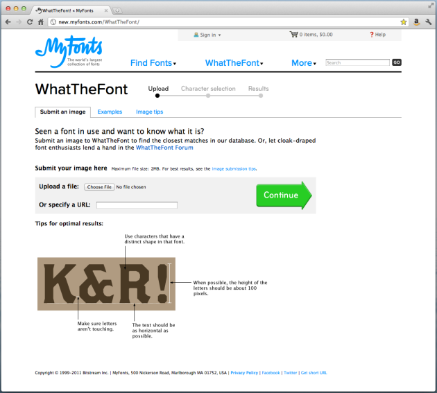
Don’t know? No problem! Continuing with the “There’s an App for that” theme, here’s another great app for graphic designers.   It is appropriately called “What The Font?” and it is a great free and easy way to find the name of a particular font.   The guys from MyFonts.com are geniuses! I wish this app were around when I was just starting as a Graphic Designer, but I’m glad it’s here now.

I initially had found it by browsing for design apps for my iPhone, but as it turns out they have a website.   So if you don’t have an iPhone or another Smartphone, you can still use this awesome app online at What The Font.

What The Font

What The Font

What you do is grab an image (online) or take a photo of the font you want to know the name of, upload it, determine the characters, and BAM! They tell you what font it is.

Ok, ok… sometimes it doesn’t work quite as easy, but then you just leave a request for the font and someone eventually helps you find the name for it (you need to sign in for this, but hey! it’s FREE!).

The great thing about this is that the more people upload images and the more fonts are recognized, the easier it will be for others to recognize fonts through the automatic process.   It is a great tool and community to use and be a part of if you are a graphic designer, or if you simply want to know the name of a particular font.

Here is a little video on how to find the name of a font. You can download the first image on this post and try it out yourself! (No Audio)


How to Find the Name of a FONT, Using What The Font from My Font

Kuler Colors

Nowadays we can do just about anything thanks to technology.   The new answer to all of life’s intriguing questions is: “There’s an App for that”.   For all of us in the creative fields, this is good news and bad news.   This means that we will be forever learning throughout our careers.   A new Adobe Creative Suite, a new Smartphone that needs user interfaces designed, a new app, you name it.   However, this is great for us, because these updates, upgrades and apps can also make our job easier.

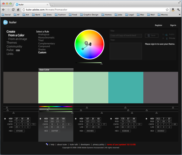
One of these cool tools we can benefit from is the Adobe Kuler color tool.   It is a FREE, yes, FREE online application that lets you create, share and explore different color themes.   This is great for us designers that sometimes have “color block”, and we can’t decide on a color scheme for a project.

Adobe Kuler

Adobe Kuler

The website is very simple to use.   You first go to http://kuler.adobe.com/, and simply begin exploring color options.   You can search a color theme by keyword, you can look at the newest, most popular, highest rated, or randomly.   You can create an account and upload your color themes.   You can make changes to a theme, select one color from the theme, select a rule like analogous, monochromatic, triad, complementary, compound, shades or even custom to find other colors for the one you have selected.   You can look at the RGB, CMYK, LAB or even HEX values for a particular color.   You can even create your own new theme using your own photos as a reference.

Adobe Kuler

Adobe Kuler

You can benefit from this great tool if you are a graphic designer, illustrator, photographer, fashion designer, interior designer, makeup artist, stylist, scrapbooker, cake decorator, painter, or any other person who at some point in their life has to pick a color combination for whatever reason.

Adobe Kuler

Adobe Kuler

Geeky Friday

Speaking of positive/negative marketing ideas…

The Buckle Up Key Holder

The Buckle Up Key Holder

The Buckle Up Key Holder

Because subliminal messages work!

Market-teen

As good artists, graphic designers tend to focus on the aesthetic aspects of their design.  They study concepts like alignment, color, consistency, constancy, figure-ground relationships, legibility, and other important components of the Gestalt principles of perception.  However, graphic designers need to remember the usual main purpose of their artwork and designs.  This general purpose of graphic designer’s art is usually to advertise.  Advertising is defined as the act of persuading an audience to do something; something like purchasing a product or service, changing their beliefs or even perceiving someone or some company in a certain way.  Therefore, advertising is not just fun cool designs, but most importantly the ability to persuade an audience.  However, how far can advertising go?  Where does the line between caring about customers and caring about sales is drawn?  Is one more important than the other?  Is advertising purely focused on sales potentially harmful to customers?  This is what Frontline’s episode on “The Merchants of Cool” seems to explore.

Reaching Teens and Reaching Others

A company’s main purpose is clearly to have enough sales to support it.  The same seems true for small companies, as well as the top companies, like the media giants such as Viacom, Disney, Vivendi, News Corporation, Universal and AOL Time Warner.  Perhaps this is why these big companies target the most profitable market, which seems to be the teen market.  The fact that teenagers have excess money to spend, and they influence their parents’ spending decisions, make teenagers a very profitable market.  These and other companies have even been using different tactics and venues to reach teens that they don’t use to reach other target audiences.  These big companies go to great extent to reach their audiences.  They actively study teenagers, they question them through focus groups and they even go as far as spending one-on-one time with ordinary teenagers in their homes to gather information about them.  The value of the teenagers’ opinions and preferences is so high, that they even let those same teenagers control what they are fed through different media outlets.  No other target audience receives such undivided attention.

An early MTV station ID

Image via Wikipedia

MTV and Their Revolutionary Advertising Ideas

The name of the television network MTV, stand for Music Television, and it was first launched in 1981 for the main purpose of promoting music and music videos.  In reality, the network should have been called ATV, for Advertising Television.  Advertising was the main purpose of MTV.  Sure, they advertise music artists and music videos, but they secretly advertise a variety of other products 24/7.  They advertise sponsoring products like soft drinks, clothing, and movies mostly created by the MTV parent company, Viacom.  As a result, the company is using this network to advertise the company itself and all the products and services the company sells.  It is pure advertising genius.

Advertising and Audiences

Getting this close to audiences can be very profitable for these big companies, however it can be very harmful to the teenagers in America.  While the advertising companies get closer and closer to their target audiences, they gain valuable insight into their worlds.  They learn how to relate and how to attract and persuade the audience to do pretty much anything they want them to do.  This situation is obviously very lucrative for these businesses, but what about the audience?  The audience, such as teenagers, are left with no privacy, no sense of their own.  Teenagers become so persuadable that they do not even notice that they are being influenced and persuaded, and they do not notice how this is happening.  This can pose a serious problem when teenage girls are persuaded to act more mature than they are, to dress sexually and provocatively, and ultimately become targets of sexual harassment, abuse and molestation.  Teenage boys are influenced to act immaturely and engage in activities that are harmful to their physical well being by shows such as “Jackass”.

Conclusion

Personally, I think that advertisement, such as the one used by these big companies mentioned above, are sadly very effective.  I believe that if these same companies would use their influence on teenagers in a good way, we could educate teenagers about what is right and what is wrong, instead of poisoning their brains with these wrong ideas of what being “cool” means.  Advertisements such as those by “Above the Influence” still use trendy elements in their ads, but they are presenting an idea that is constructive to the society in trying to keep teenagers out of drugs (Abovetheinfluence.com).  In this case, all the research about teenagers and what they find “cool” or “trendy” can help influence teenagers to stay out of drugs.

The video of the Frontline episode regarding “The Merchants of Cool”, definitely expand on my belief of what is wrong with society today.  How can we expect the future leaders of the world to be good ones, if all we are teaching and feeding them is ideas that smoking is “cool”, having lots of sex is “cool”, and doing drugs is “cool”.  However, as hypocritical as it may sound, we are consumers, and even though I do not agree with the impact of these advertising techniques on teenagers and their development, I don’t think that it would impact what kind of products I chose to purchase.  I do believe however, that when the time comes I will teach my children not to fall for those advertisements and not to think that those things are “cool” just because the commercial or MTV said so.  They should form their own opinions of what is right and wrong through the teaching of their parents, school and religion, and not through the media.

Frontline: The Merchants of Cool [Video file]. Retrieved from http://www.pbs.org/wgbh/pages/frontline/shows/cool/

Marketing & Stereotypes: The Abercrombie & Fitch Story

Nowadays it is human nature to attempt to classify people, products and brands into different stereotypes.  A stereotype is a standard classification that individuals commonly classify other people, products and brands.  People are stereotyped because of race, ethnicity, sexual orientation, gender, and even the types of products they buy and clothes they wear.  Stereotyping is not something that should be practiced, because it is wrong to assume an individual’s personality or beliefs based on their looks, clothes or products they purchase.  Even though stereotyping is not something highly recommended by society, people still stereotype other people based on such shallow observations.  One example of stereotyping based on clothes is the stereotype or label of “Preppy”, “Preppie” or “Prep” given to individuals who wear clothes sold by stores like Abercrombie & Fitch, Hollister and American Eagle.

The word “preppy” actually came about in the 1950’s, and it derived from “preparatory schools”.  The White Anglo-Saxon Protestant, or WASP term was highly associated with the term “preppy”.  The WASP community was mostly high-class individuals who attended such prestigious schools and dressed in a laid-back, yet luxurious clothing of brands such as Lacoste and Lilly Pulitzer.   This style was then re-launched by stores like Abercrombie & Fitch in a more affordable price for teenagers of modern days that belong to the middle and higher social classes.  The preppy kids back in the 1950’s where actually members of high-class societies, went to Ivy League colleges and universities and private preparatory schools, they owed yachts and boats, and could afford expensive taste such as Ralph Lauren.  The preppy kids nowadays do not form part of such high-class and do not own expensive boats or attend prestigious colleges and schools, but they can afford to look like they belong to the same high-class as the 1950’s preppy kids because of stores like Abercrombie & Fitch.

Abercrombie and fitch Paris summer 2011 advert...

Image by cattias.photos via Flickr

Abercrombie & Fitch Users and Stereotypes

I do believe that users and consumers of Abercrombie & Fitch clothing identify with the “preppy” stereotype.  The Abercrombie & Fitch crowds are labeled by others as “preppy”, and they do not consider this an insult, but instead a compliment.  “Preppy” kids are usually the popular kids in high schools who are concerned with looks, popularity and material possessions.  Even though some of them do not belong to high social class, they like thinking that they look that way.  The reality is that Abercrombie & Fitch is not actually a real “preppy” store, because they are not as expensive as the real “preppy” clothes like Ralph Lauren, Lacoste, Tommy Hilfiger, etc.  However, the style does look like the more expensive stores.

Abercrombie and fitch Paris summer 2011 advert...

Image by cattias.photos via Flickr

Stereotypes and Sales

The “preppy” stereotype helps Abercrombie & Fitch sales.  Mainly because most middle-class teenagers who wish to belong in the popular group may not be able to afford the real expensive “preppy” brands like Lacoste.  Therefore, they will choose to shop at Abercrombie & Fitch because the clothing looks like the more expensive clothing and has the same “preppy” style, but it is much more affordable for teenage kids with a middle-class allowance.  The more they wish to fit in to the popular crowd the more clothing they will buy from stores like Abercrombie & Fitch.  The “preppy wannabe” crowd purchase clothing from Abercrombie & Fitch basically because of the way it makes them feel.  The clothing makes them feel like they belong in the “preppy” crowd.
The image of Abercrombie & Fitch today.

Image via Wikipedia

Stereotypes in the Advertising Campaigns

The Abercrombie & Fitch advertising campaigns most definitely intentionally designed to target the “preppy” and “preppy wannabe” crowds.  If we look at their advertisement and images placed throughout their stores we can appreciate the intent of the ads through their design, and specifically the scale of the photographs being displayed at each store.  Most of their advertisement feature clean-shaved, clean-cut, muscular, slim body, Caucasian, good-looking people.  These are the typical characteristics that fit the “preppy” individuals.  Another major effort from this company to keep the advertisement targeted at “preppy” teenagers is the fact that they hire people who fit into this stereotype to work in their stores.  There have even been lawsuits against the company because they would not hire a Muslim individual, according to her, because of her headscarf.  There was another case of another teenager who claimed they would not let her work outside of the back storage of an Abercrombie and Fitch store because of her prosthetic arm.

Geeky Friday

Pantone Themed Products

This slideshow requires JavaScript.

Because some people could use a little color in their lives.

Find these products online here:

http://www.pantone.com/pages/pantone/category.aspx?ca=33 
http://www.chroniclebooks.com/titles/pantone-100-postcards.html
http://www.uncommongoods.com/product/pantone-mug-set-of-10
http://www.uncommongoods.com/product/pantone-boxes
http://www.seletti.it/pantone/pantone_xmas_ball.htm
http://www.uncommongoods.com/product/pantone-folding-chairs


Branding and Re-Branding

As Graphic Designers, we should constantly be aware of our surroundings, paying attention to design styles, trends and branding.   Branding can be defined as the process a company uses to build awareness about their products and organization, as well as to extend customer loyalty.   The branding process involves several steps to ensure successful branding of the company and its products.   The steps involved include conducting research, clarifying strategy, designing identity, creating touchpoints and managing assets.   Many companies have modified their branding strategy in the last step in order to change their branding, diversify their branding or limit their branding.
A good example of a company that has managed its assets in order to change and diversify its branding is Federal Express.   Founded in 1993 as Federal express, the company later changed its name to FedEx Corporation.   Later, the company acquired different logistics and shipping companies to provide a wider list of services.   The company now has several different company services such as FedEx Express, FedEx Ground, FedEx Freight, FedEx Custom Critical and FedEx Trade Networks.   Each logotype for each service is the same; the difference is that the word “Ex” is color coded to each service.   For example, FedEx Corporation is grey, FedEx Express is orange, FedEx Ground is green, FedEx Freight is red, FedEx Custom Critical is blue, and FedEx Trade Networks is yellow.

Fedex truck

Image by Crystian Cruz via Flickr

The choice to diversify and expand the company branding was ultimately beneficial.   Because of their diversification and expansion, FedEx could now provide different types of services to their loyal customers under the same recognizable branding.   The identity risks of expanding the company’s branding to a number of different services is that the customer could be confused when identifying the company, a particular service or the parent company.   The visual branding considerations that a company must keep in mind when expanding its brand identity is, like in FedEx’s case, to not alter the original branding so much that the customers are unable to recognize the parent company.   Looking at FedEx’s decisions to expand and the branding that they chose, I think it was a good idea and it was executed perfectly and it ultimately was a success for the company.

1,000 Visits

Thank you! Today, October 19th, 2011, I have reached 1,000 Visits on this blog.   I am honored!   I wished I could thank visitors personally, but I have no way of knowing who they are.   Either way, as a special thank you for visiting my blog I have decided to write this post and leave an open thread for any special Design, Photo, Apple or even Geeky Request or Questions.   So go ahead, ask and you shall receive!

Thanks again!

What is the Design Brief? And Why Do I Need It?

As we embark on a new project for a new client, there are certain steps we must follow, before we even begin to create any designs for the project.   We can’t just simply jump on the computer and begin creating anything that we can think of for the project.   We must first complete those specific steps.   This is when the design brief comes in.

The Design Brief and its Importance

A design brief is the first step of a design project.   The brief is a thorough document that provides an overview of the entire project.   This document informs the client, as well as the designer and everyone else involved, about the steps to be completed before, during and after the development and production of the project.   The design brief is very important and should be revisited before, during and after the project is completed.   The design brief will also serve as a reference document to guarantee that the finished product fulfilled the design’s objectives, it will reach the specific target audience, and it is following the predetermined path.

Parts of a Design Brief

Design briefs can vary when it comes to content.   The design brief template or parts should be tailored to each individual type of project and client.   However, there are a couple of important sections that must always be present.   A design brief should be thorough, clean and organized so that all the parties involved have a clear understanding of the entire project.   Most design briefs usually include a cover/title page; a table of contents page; an executive summary or corporate profile of the client’s company; an overview of the current situation of the company; information about the target audience; the overall objective of the project; description of the components or deliverables; a timeline for the project’s completion; the budget allotted for the project; personnel requirements; and payment schedule.

Importance of Research

Conducting research about the target market and current competitors of a specific project is crucial.   In order to tailor a design and effectively communicate the message to the target audience and to persuade the consumer that the product is better than the competition, we must first understand who is going to read the message (target audience) and what are the competitors saying about their products.   If we launched an advertising campaign for an educational product for elementary school students and we used a scary monster as the image of the product and we had the same message as one of our competitors, we would be ignoring the target audience and the current messages by competitors.   In order for the campaign to be successful, extensive research should be conducted about the target audience and competitors.

Important Steps

I believe that the most important steps in a design brief are the project objectives, target audience and competitors.   The same goes for the creation of a new product.   In order to successfully create a product or a design package for a product, we must first know what is the message we are trying to convey, who is this message aimed at, and what are other companies saying about their similar products.   When we research and understand these three steps then we can tailor the message to the right audience.

Here is a downloadable example of a Design Brief prepared as an assignment for an Advanced Graphic Design I class, as a mock proposal for an existing company that specializes in educational software and gaming systems for elementary school children.

Design Brief Sample

Other Designs II: Environmental Graphics

Graphic Designers who wish to be true successful professionals, must be aware and knowledgeable in all matters of graphics and designs including different types of designs.  Environmental graphics are one of the many types of designs a graphic illustrator can create.  Environmental Graphics are designs that include architectural elements in order to better inform and create a spatial organization of a specific area or place.   Environmental graphic design is actually a profession in which designers create such graphics concerned with wayfinding, or the idea of using graphical icons in order to navigate an environment, such as maps and signs.

Thinking back to the beginning of civilizations, when roads where being created and buildings being constructed, back when the need for environmental graphics became clear, it is no different from nowadays.  With the advancement of society and technology, new needs will rise and new needs for graphics will rise as well.  The need to label the environment around us to better navigate it will always be there.

In my opinion, the future will bring change to the environmental graphics and their designers, but they will still be needed.  For example, cartographers used to create maps for individuals to be able to commute from one place to another.  Nowadays, technology has created interactive maps that are installed within our cars that literally “tell us” how to get from one place to another.  However, there is still someone who needs to design the digital maps and user interfaces of these navigation systems.

I also believe environmental graphics will not be obsolete, they will always have use, because people will always need to know how to get from point A to point B, whether it is from the parking lot to the emergency room in a hospital, or from Miami to New York.  The way we search for and retrieve the information may change from a physical map to a navigation system, cell phone or computer.  We might even have digital transparent air-screens pop up in front of us magically by just thinking of them, but there will always be a need for the actual design of the information, the user interface and the information itself.

One of my favorite things is actually creating maps.   I am sharing two different maps here, one of a fictitious mall and another of a building.

Fictitious Mall Map

Fictitious Mall Map

Floor Map

Building Floor Map

Other Designs I: Package Design

There are tons of different types of designs and design branches that a Graphic Designer may choose to specialize in.   For example, a Graphic Designer may choose to focus only in Web Design.   Perhaps another Graphic Designer realizes his or her Illustrating capabilities are great, so they may focus only in Illustration.   Other Graphic Designers create great logos, so the mainly focus on that and on corporate identity design.   There is also product and package design, and some professionals may focus mainly on those types of designs as well.

Product & Package Design: A Lucrative Business?

Package design is the combination of planning and creating the structure, form, and appearance of a specific product’s packaging, and it functions as an encasing, protection of the product, promotion of a brand, presenting information, and turns into a brand experience.   Billions are spent in packaging every year, and the reasons are pretty obvious.   I believe that the most important reason why product and package design is such a lucrative business is because the package of a product ultimately determines whether customers purchase the product or not, because it is the first impression they get of the product and the company.   Other reasons why packaging is important include the fact that packages protect the product, it keeps components of the product together, it identifies the product, it protects the product during transportation and makes transportation easier, it makes it easier to stack and store product and you can include printed information on the package such as the price.

Design Steps in Package Design

The package design process involves five different phases, which are: Orientation, Analysis, Concepts, Design and Implementation.   Orientation and Analysis include defining the problem, establishing goals, determining the project scope, conducting research, preparing marketing and competitive audits, researching the competition, researching the target audience, establishing positioning, establishing brand personality and setting a strategy.   The Conceptual Design phase includes making sure that the offered solution is in line with all the research conducted in phases one and two and also that the solution has on-shelf impact.   The Design Development phase implements the concept into an actual design and makes sure that it is visually sticking and interesting enough to catch the attention of the target audience and ultimately make the customer purchase the brand over the competition.   The Implementation stage is the final creation of the three-dimensional and physical box or package for the product.

Prototypes Through The Ages

Nowadays, hardly anything is created without using a computer.   But a long time ago, in simpler times, people still communicated and created things without computers.   Prototypes where created a long time ago without using computers.   We could say that the first prototypes where created in the 4000 BC years by using clay.   Clay was used to create clay models to represent mythological creatures and gods, later turned into stone sculptures.   Later, during 3000 BC paper and ink was used to plan and create prototypes of incredible monuments like pyramids.   During 1452 and 1519 Leonardo Da Vinci himself created paper models as concepts of his extreme ideas, using also other materials like wood and carving techniques.   Thomas Edison also created multiple prototypes when creating initial concepts of his inventions, like the phonograph, the motion picture camera and the light bulb during the 1800s and 1900s.   Henry Dreyfuss in the 1900s took the concept of design and prototyping to the next level and his understanding of the function of prototyping is the initial idea of our modern understanding of a prototype, because he created the prototype as an illustration of a product in context.   Before 3D rendering was invented, product prototypes and packaging where constructed by hand.   For example, a product prototype could be sculpted out of clay or wood, and a package design could be printed and assembled by hand to view the 3D version or final result.

To Window Or Not To Window?

When constructing the mock-up for a package design, there are some very important factors one should consider before deciding whether the product should be seen or if the package shouldn’t have a window.   One of these deciding factors is the visual appeal of the product itself.   If the product is visually striking by itself, then the product should be showcased through a window in the package.   If the product is not particularly visually striking then the package should make up for that and there should be no window displaying the product.

Mock-Up Package Design

A good idea to “practice” package design and see if it is something you as a designer would be interested in doing, is to create a mock up package design for any particular product.   I created a mock-up package design for a class assignment for a LeapFrog product.   Here is the package design in it’s “flat” printed version as well as in the three-dimensional version of the assembled box.

This slideshow requires JavaScript.

Also, here is a 2-part video describing a simple way of creating the three-dimensional version of the package design using Adobe Photoshop.

http://www.screencast.com/t/y83nSoHJV

http://www.screencast.com/t/iZbwZprqR9u


More Tips on Creating a Portfolio and Presenting It

Professionals whose occupation involves creative designs such as artists, photographers, graphic designers, fashion designers and interior designers, should have their personal portfolio.   A good portfolio presents quality not quantity.   As time passes, designers should also update their portfolios, and some pieces should be re-vamped as needed.   A portfolio can determine your employment or lack of, because some companies do not even schedule an interview without first looking at portfolio submissions.   Your portfolio is then, the first impression.   Therefore, as creative professionals, we must learn what makes a good portfolio.

Not only does a designer’s portfolio should speak for itself, but it should also represent the designer’s style in the design of the actual portfolio.   This is also true for the designer’s resume, letterhead, business card, and even the envelope.   If you are unable to create a successful visual identity for yourself, then how could you do so for a client?   This is also true for your entire appearance during an interview, the way you present yourself, and most importantly, the way you present your portfolio.   A prospect client or employer will begin to evaluate you from the moment you first make contact, whether it is in person, by e-mail, by phone, or with a cover letter.

Design Conventions of A Portfolio Presentation

What to consider:

Labels.   Each piece should provide sufficient information about itself.   A title, a description, and the software you used to accomplish the piece.   Reference, if necessary, of elements used in the piece that you did not create yourself.   You do not want to take credit or something you did not do.  However, as a rule, is best to have pieces that you created entirely by yourself, than pieces you created by collaborating with other designers, or pieces that use stock images or illustrations.

This slideshow requires JavaScript.

Tailoring and Interchangeability.   As a designer, you will probably go to several interviews before you find your first job.   Having a portfolio that lets you easily change one piece for another is key to tailor each portfolio presentation to the job you are applying for.   For example, if you apply for a company looking for an in-house graphic designer to create all their advertising graphics, you could switch a logo design for an ad.   Or if you are applying for a company that specializes in designing logos for companies, you can add a couple more logo designs and take out some photography editing examples.   If you were applying for a photography job at a studio, more family, children and baby shots as well as headshots would be good.   If you were applying for a job as a stock photographer, photos of objects, landscapes, animals and business subjects would be best.

Various Formats.   You never know what kind of time does your prospect employer devote to looking through countless applications and portfolios.   Why not make it easier for them by providing a link to your website with your portfolio on it, or a CD/DVD presentation.   You could always bring your classic portfolio with you if you happen to get an interview, or leave behind a CD/DVD copy or a business card with a link for them to be able to view your portfolio again at their convenience.

Prepare to Present/Explain.   If you have a great portfolio, but you don’t know how to talk about each piece and explain it, then you might as well have no portfolio at all.   Be prepared and practice to talk about each piece and answer any questions that may come up.

Follow up.   Don’t just drop of your resume and portfolio and expect it to do all the work for you.   Make sure you keep in touch and even if you don’t get the job, show appreciation for the opportunity and make sure you are kept on their records for future reference.

Update.   Technology is always changing and innovations keep coming up.   Maybe 10 years ago you couldn’t add a drop-shadow to your text, but now you can.   Update your portfolio with new pieces and re-vamp the ones you created a long time ago.   Keeping your portfolio fresh can show that you are up-to-date with the newest trends and technology.
The actual design of your portfolio.   Some designers get carried away by “designing” their portfolios.   They add background, animations, bells and whistles, things you really don’t need.   Remember to keep it simple and don’t let the actual design of your portfolio overshadow each piece inside your portfolio.

Work Selection and Sequence:

Quality vs. Quantity.   It is not about how many pieces you have; it is about the quality of each piece.   A portfolio should have between 20 to 40 pieces at the most.   An employer could get lost in all the pieces, and they probably do not even have the time to view them all.   You have to select pieces that are strong.   Don’t select pieces that you are not confident about.

Strong Start/Finish.   Several websites and individuals recommend that your strongest pieces are located at the beginning and at the end of your portfolio.   This way, when a possible employer opens up your portfolio, they are immediately impressed, and when they get to the end, they will remember you.

Location, location, location.   The order in which you “locate” your pieces is crucial.   Each piece should follow the other with some kind of connection, whether it is chronological, by theme or any other connection.   This will make it easier to transition from one piece to another and make it easier for you to be able to talk about them in person and explain the relation.

Websites  to visit:

http://www.howdesign.com/article/PortfolioPresentation/

http://www.aiga.org/content.cfm/portfolio-presenting

http://www.designertoday.com/Articles/3940/Portfolio.Making.Your.Best.Presentation.aspx

http://www.youthedesigner.com/2008/06/30/12-steps-to-a-super-graphic-design-portfolio/

http://veen.com/jeff/archives/000935.html

http://layersmagazine.com/the-dos-and-don%E2%80%99ts-of-portfolio-presentation.html

http://biznik.com/articles/ten-or-11-tips-for-presenting-your-portfolio

Tips on Creating an Online Portfolio

A graphic designer or photographer fresh out of college will probably have to attend several interviews before landing a first job.  Interviewing and presenting a portfolio face-to-face can be nerve wrecking and stressful because it is difficult to talk about one’s own work, but if you attend an interview and take your portfolio with you, you can make sure that your portfolio is reviewed by the potential employer.  Having an e-portfolio, on the other hand, does not ensure that potential clients and employers will magically come across your portfolio and hire you.  Advertising and marketing your e-portfolio is a very important task that should not be left aside.  If you want your e-portfolio to land you a great job or a few freelance jobs, then you must advertise and market your e-portfolio. Lets look at some ideas to successfully advertise and market e-portfolios.

Fresh Site

In order to create and keep a site fresh, the design must remain simple, and easy to read and to navigate.  According to Steve Krug (I recommend his book), the first law of web usability, or the ease of using and navigating a website is to not make your audience think (2006).  This means that a well designed website should be obvious, self-evident, and self-explanatory.  This way the readers and viewers of the website don’t have to feel like they are solving a riddle just to check out your portfolio.  Chances are that if the viewer of a website has to make more than three clicks to get where they want to get, they will not continue to view the website and most likely they will move on.  Clogging website with a lot of text, animations and images will make a site look busy instead of fresh.  Therefore instead of adding something to keep the site fresh, the key is to keep it simple, neat and organized.

Interactivity

When visitors enter a website there are several different ways they could interact with the website.  In a good e-portfolio website there should be a good amount of interactivity with the reader.  The e-portfolio should be designed in a way in which the viewer may chose to play a slideshow of all the pieces in the portfolio, and also skip images and go back and re-visit images that caught their attention.  Therefore, a good interactive portfolio would have play buttons, pause buttons, stop buttons, forward and backward buttons, as well as a thumbnail for each piece in the portfolio.  This way the user may navigate the portfolio in any order he or she wishes making the experience of viewing the portfolio almost the same as viewing a traditional printed portfolio.

Standing Out

Usually, people tend to think that in order to stand out one should include as much text, animation and images as possible.  However, this would most likely make a website very difficult to read and navigate through.  A great way to stand out would be to think about three characteristics that describe you as a designer, for example: Straightforward, Reliable, and Inspired.  Then, your e-portfolio and website should attempt to express those characteristics and remain within the same theme of your resume, logo and promotional piece.  For example, since one of the characteristics is straightforward, then the website should not have mystery passageways to get to the point, but all the main points and information should be clearly and legibly displayed.

Attracting Visitors

Once the fresh, interactive and attention-grabbing website is in place, the next step would be to attract traffic to the website.  The first step would be to include your domain name, like http://www.johndoe.com on your e-mail signature, your letterhead, business cards and even your resume. You should also include it both as text and as a link in your promotional materials, like a web banner.  Nowadays, there are a wide variety of free ways to promote your web on the Internet.  You can create a newsletter and advertise your newly launched web to all your contacts and ask for them to forward the information to their contacts.   Just be sure not to spam your friends’ inboxes.   You can create a professional account for your business on many social networking sites like Facebook, Twitter, Linked In, Google Plus, and MySpace.  You may even create ads that circulate on those social networking sites promoting your business.  When you design websites for other companies you can place your name and website as the web designer of that page at the very bottom, with their permission of course.  In conclusion, there are plenty of ways to advertise one’s website on the web.

Good Examples

Search for other designers or photographers’ portfolios online and see what they are doing.   Lissete Rodriguez’ portfolio retrieved from Dexigner.com (http://www.zetdesigns.com/) stood out from the rest because it was fresh and simple.  She included interactivity on her web portfolio by adding rollover animations and a slideshow of her pieces.  However, even though her web included slideshows and animations, it did not distract the viewer from her work.

Lissete Rodriguez's Online Portfolio

Lissete Rodriguez's Online Portfolio

Joe Nyaggah’s portfolio retrieved from Graphicdesignblog.com (http://danjoedesign.com/) was also very minimalistic and simple in its design, which kept the site fresh. He included some rollover effects for interactivity, however, it was lacking on that function.  Perhaps his portfolio should have been presented in a slideshow manner with buttons for easier navigation.

Joe Nyaggah’s Online Portfolio

Joe Nyaggah’s Online Portfolio

Free Online Web Portfolios

There are some relatively new websites out there that have a designer network and free (for the most part) online portfolios.   These are a great way to start if you don’t really know anything about web design and development, because mostly all you have to do is upload your images and input your information.   So if you use Facebook, you can use these:

http://prosite.com/

http://www.pixpa.com/

http://carbonmade.com/

http://www.behance.net/

http://cargocollective.com/

http://www.squarespace.com/

http://www.thecreativefinder.com/

References

Krug, S. (2006). Don’t make me think! A common sense approach to web usability (2nd ed.). Berkeley, CA: New Riders.

Working with Clients

If you have already worked as a Graphic Designer, either as a freelancer or within a company, you already know the difficulties you may face with certain clients.   Like in any other career field, you have a client, and a product or service you provide.   Sometimes what the client expects or thinks about that product or service, is not actually what the company or freelancer offers.   The most important step is to know everything about a project from the very beginning.   Also, having constant communication with the client will help with the success of the final product, service or design.

Final Say

As graphic designers a client generally approaches us with a design problem, and we are required to find a solution.   The client is the person who ultimately has the final say on what the product should look like and how it should work, based on their own knowledge of the target audience they are trying to convey a message to.   As a graphic designer, you should approach the situation as if you where part of that target audience.   The reason is so that you can advise your client on what is the best way to reach their target audience in terms of a good design.

For example, if a client comes to you and asks for a flyer to advertise their online business like an online only shoe retailer, you may suggest that an e-mail advertisement would be best to reach their target audience (clients already using the internet, and on their client database).   However, your suggestion may be ignored and the client could still decide to go with the printed flyer.   Your job as a designer is to design the flyer and that’s it.   If they did not agree with your suggestion, then you should provide what they are requesting from you.

Freedoms

The freedoms you have, as a designer in the process, will depend on each project.   Some clients may have no idea what they want their design to look like, and they may tell you to come up with something on your own, and that you may choose colors and everything, so you have a lot of creative freedoms with those clients.   Some other clients know exactly what they want and what they want it to look like, and they would even do it themselves if they knew how to use the software, so you may have very limited freedoms with those types of clients.   Some clients know more or less what they want, but they need your design expertise to guide them when choosing design elements, typefaces and colors, so you have some limitations and some freedoms with those types of clients.   You are most definitely allowed to refuse providing services to certain clients, before beginning to work with them, if what they are trying to create is illegal, or against your beliefs, morals or religion.   But you must do so respectfully to their needs, or perhaps suggest a different designer that you know can help with their situation.

Steps to Follow

As a graphic designer, you must plan on taking several steps to assess the situation and the perceived tasks ahead to rectify the situation.   First and foremost, you should analyze each project individually to make sure that the project’s extent is within your technical capabilities.   Second, you should ensure that you have all the information from the client about the project.   Third, you should provide the client with the proper documentation about the project (design brief) and come to a written agreement about the course of action with the client, including the amount of “changes” allowed and charges that go along with those changes.   Finally, you should provide a summary after the work was completed to show the client how the design solution successfully solves the design problem.

Ethical Issues in the Graphic Design Business

During our careers, whether as graphic designers, web designers, fashion designers or any other career, we will most likely have to learn about ethics in the workplace.  Ethics do not only play a role in our normal day-to-day activities, such as attending a wedding, tipping our waiters and receiving guests in our home, ethics also are a part of our business life.  There are several ethical issues that can arise in the workplace, no matter the type of work.  Ethical issues are subjects or events that could create questions about what is right and what is wrong.  Even though there are many ethical issues that could rise in all types of jobs, there are also ethical issues that could rise in jobs that are only related to design.

Ethical Issues in Graphic Design

A Graphic Designer, especially a Freelance Graphic Designer, encounters numerous of different people and companies that they will probably do design work for.  However, the graphic designer may or may not agree with what that particular company or individual stands for or wishes to advertise.  This raises a question of right or wrong, an ethical issue, for the designer.  Graphic designers should know from early on in their career who would they not design for and who would they design for, keeping in mind that what a graphic designer creates is a message for an audience.   For example, would you create campaign posters for a politician who approves of abortion; would you create a logo for a rock band that believes in and follows the devil’s teachings; would you create a package design for a company that sells cigarette shaped candy to children; or would you create a website for a pornographic site.  The decision will always be up to the graphic designer and will most likely depend on his or her own morals and belief system.  Ultimately, if a designer does not agree with it, then he or she should not take on the work.

There are several other ethical issues that arise in fields such as advertising.  Since most graphic design products fall under this category, graphic designers would most likely have to face those same ethical issues faced by advertisers and advertising agencies.  For example, a graphic designer could be offered to produce an ad, but then he or she could find out that the information in the ad was a product of false advertising.  False advertising means to promote a feature or characteristic in a product that is in fact not true.  In this case, the designer would also have the choice to produce the ad or simply walk away.

Another big ethical issue that a graphic designer could encounter is the issue of copyright and piracy.  Copyright is the legal right that the creator of a design (or any other work) is granted.  The creator or designer owns the rights to the design.  Just like writers have ‘writer’s block’, graphic designers sometimes also have phases in which they are not particularly creative.  This could lead to using someone else’s work and ‘revamping’ it to seem as though you created the whole thing.  This is an illegal practice called piracy.  Graphic Designers should definitely avoid doing this unless they give full credit to the copyright owner, ask for their permission, or use copyright free images.

Design & Culture

Graphic Designers are usually taught about the technical aspects of the career, the software, the design elements, the design principles, and so forth.  However, graphic design is not only about the creativity and ability to create a ‘pretty’ design.  Graphic design is also about the audience for which the design was created.  Many students, and even teachers, forget the audience.  By doing so, several cultural issues may rise.

Culture is defined as the collection of customs, social behavior, and ideas of a specific group of individuals.  Therefore, what might seem as a successful design here in the United States might seem offensive or even harmful in other countries.  For example, a design that includes a hand giving the “thumbs up” may be appropriate for an American audience, but this sign is considered a rude gesture in some Asian and Islamic countries. A recent animated footage which includes the 2012 Olympics had to be removed from the organization’s website because it was causing epileptic seizures to viewers who suffered from epilepsy.  We must always be careful not to insult offend or harm the viewers of our designs.

From Illustrator to InDesign

When using page layout applications like Adobe InDesign or QuarkXPress, designers are usually creating art for printing, for the web, or for mobile devices.  Depending on the final output of the design, the designer will choose a different file color mode, such as RGB or CMYK, different file dimensions, and different file weigh.  Therefore, the designers must usually create all parts of the artwork in other applications like Photoshop and Illustrator, with the final output in mind.

When it comes to Adobe Illustrator, there are two different options for creating files.  The designer may choose to “Save” the artwork, or “Export” the artwork.  When saving the artwork, the designer may choose from several file formats like .ai, .pdf and .eps.  When exporting the artwork, the designer may choose from other file formats like .tiff.  However, one thing must always be kept in mind, the designer should always save an original copy of the artwork in an editable format will all editable layers and text, which would be the original Adobe Illustrator format, .ai.

This slideshow requires JavaScript.

Now, when it comes to saving Adobe Illustrator files to later use inside InDesign page layouts, we can use PDF, TIFF or EPS files.  Therefore, a second copy of the original file must be saved for the sole purpose of importing to InDesign.  Once the page layout is completed and it is time to import artwork created in Adobe Illustrator, we can select the “place” option in InDesign.  In theory, all 4 file types, AI, PDF, TIFF and EPS can be placed using the “place” option within InDesign.  However, we might encounter some problems with each file.

The Adobe Illustrator file may not place correctly if the “Create PDF Compatible File” option was not selected when saving the original Illustrator File.  The PDF file will be placed correctly, but there will not be a transparency effect for the background of the object placeholder.  The TIFF file may place correctly, but like the PDF file, the background will not be transparent, and the quality of the image will be determined by the specifications made when saving the TIFF file.

EPS files are virtually accepted by every page layout, word-processing and vector applications.  When saving EPS files from Adobe Illustrator, there are far more options available to the designer, than when saving any other file type.  An important option is saving a transparent background, which would import perfectly to InDesign.  Another important option is the “Embed Fonts” option, which will ensure that the correct font will appear when printing an imported EPS file into InDesign.  Although, the designer could always save a copy of the original Adobe Illustrator file, with all the text outlined, but it would not go well if all you had was this outlined file for last minute text changes.  Another great option is the “Include Linked Files” option, which will ensure any placed and linked files within the Adobe Illustrator original file will not be missing once imported into InDesign, which is possible, because EPS files may contain both vector and bitmap graphics.  With all of these options, it is clear that the best file format to use in this case would be the EPS file format.

Nevertheless, there are plenty of export and save options for a reason, and that is because one file format may work best for one particular type of project, and another format may work best for another type of project.  This is why there is not and should not be one particular standard file format.


Inspiration Can Be Found Anywhere (Part II)

Back in February of 2005, while attending community college for a Graphic Design Technology Degree, I was lucky enough to be selected by my Drawing I teacher to participate in a school-funded trip to New York, and witness something amazing.  I had only been to New York once before when I was little, I had never been to Central Park, and I had also only experiences snow once before, when I was little. The trip consisted of a three days stay in New York City, visits to local museums, like the Museum of Modern Art (MoMA), and a visit to Central Park, where artists Christo & Jeanne Claude had created something very special. Witnessing this amazing installation in Central Park by these artists was a once in a lifetime experience, and I am very lucky to have been able to participate in it. I enjoyed this installation very much.

This slideshow requires JavaScript.

Christo & Jeanne-Claude

Christo was born in 1935 in Bulgaria; he studied art there and also in Vienna before moving to Paris and beginning to develop himself as an artist creating wrapped packages. When he married Jeanne-Claude, they began to wrap larger objects collaborating with each other as artists. Christo first began by wrapping smaller objects in different fabrics and ropes.  He would wrap items like books, magazines, chairs, motorcycles, tables, and barrels.  Later, with the help of Jeanne-Claude, he was obtaining permits in different cities to wrap famous monuments, fountains, and even buildings in fabric and ropes.  Some of the large-scale things that they have wrapped are the Kunsthalle, an art museum in Switzerland; the Museum of Contemporary Art in Chicago; 1 million square feet of the coast in Little Bay, Sydney, Australia; and the Pont Neuf Bridge in Paris.

Christo and Jeanne-Claude did other installations aside from wrapping existing objects in different types of fabrics and colors.  They also created their own installations with fabrics from scratch.  They used orange colored fabric to create a wall in Colorado.  They created a long wall that stretched 24 miles in California, using a white fabric. They surrounded the island in Biscayne Beach, Miami, Florida with a bright pink fabric. They created umbrellas out of blue and yellow fabric to decorate fields in both Japan and California respectively.  Finally, in New York’s Central Park they adorned all the walkways with bright orange gates that where constructed with metal frames and orange fabric.  Currently Christo has two works in progress including one in the United Arab Emirates and one in Colorado.  Unfortunately Jeanne-Claude will not be helping him with these projects anymore, because she passed away in 2009 do to a brain aneurysm rupture.

Color & Texture

Christo and Jeanne-Claude’s artwork is a one of a kind transitory experience. They raise the money for their big large-scale projects by selling their initial sketches for the projects themselves. They must complete numerous preliminary work such as obtaining countless permits, economical resources and volunteers that would help with the installations. The main design elements of such elaborative pieces are colors and texture. Their use of different fabrics and colors is very unique. When they wrap all these monuments, or create these installations, they definitely change the environment by dramatically altering the texture of such monuments and the colors within nature.

When I was experiencing New York’s Central Park for the first time, with Christo and Jeanne-Claude’s installation in it, “The Gates”, the experience was quite interesting. The setting was a cold February in New York winter, and all the colors of the white snow and the blue skies, where split-compliments of the brown trees and the bright orange gates.  Whiteout the gates, Central Park would have felt very cold, and blue, as far as colors goes. However, the warmth of the orange made the installation pop out on the canvas that was the park. The texture of the fabric used for the gates was very fascinating. The texture appeared simple just like regular cotton, however it was very different when you actually touched it. It was permeable and had a patterned texture to it, like tiny little dots that your fingers could read. This seemed to contrast with the rest of the textures in the park like the trees and the snow. Overall, Christo and Jeanne-Claude have exceptionally and innovatively used both color and texture to alter the norm, and to pose a different view and feel in rural and urban settings.

Please visit Christo and Jeanne-Claude’s website for pictures of their work.

After this trip I took a Photography class in which our teacher took us on a walkthrough to the Las Olas Riverfront to take pictures outdoors.   I was trying to look for interesting shots.   The day was beautiful for picture taking, there was not one cloud in the sky and it was the brightest blues I had ever seen.   Looking up to the sky from the riverfront walk I saw some very bright yellow umbrellas from a restaurant on the second floor.   The contrast between the warm yellow tones and the cool blue skies, reminded me of one of Christo and Jeanne-Claude’s work.   I was inspired by it and I took this photo:

Umbrellas

Umbrellas

Inspiration Can Be Found Anywhere (Part I)

I first encountered Leopoldo Metlicovitz’s posters at a very young age.  My grandfather loves music, and more specifically, he loves opera.  Throughout his home there are several opera posters of the early 20th century, including two of the four seen the photo below, which are all poster designs by Leopoldo Metlicovitz.  Throughout my life I had seen these posters all over my grandfather’s home, and whenever I saw the poster elsewhere it would remind me of my grandfather and his love for opera.  I had always enjoyed the top left poster for Madama Butterfly by Giacomo Puccini, because it had certain mystery about it and I also liked the name “Madama Butterfly”.

Leopoldo Metlicovitz Poster Designs

Leopoldo Metlicovitz Poster Designs

Last year in school I had to design my own 20th century poster, and for that particular assignment I remembered those posters I was exposed to throughout my life and immediately searched for opera posters for the early 20th century to inspire me.  To my surprise, designer Leopoldo Metlicovitz is the creator of some of my favorite opera poster designs.  I enjoy the Madama Butterfly poster design because of the use of color and contrast from the inside of the window with dark red tones and the outside of the window which depicts cherry blossom trees with light pink and brown tones and a robin nesting on a tree.  I enjoy the contrast of color as well as the placement of the text underneath the seating female figure.  The use of light and dark to express the folds on the figure’s clothing is very interesting and it explains how the light from the window is approaching the figure.  I particularly enjoy how the painting explains an act of the opera where the female figure, Madama Butterfly, awaits her lover.  The rest of Metlicovitz’s designs are similar in color contrast.  The artist seems to use dark tones like red for the negative spaces and then lighter pink tones for flowers and lighter skin tones for the female figures. Negative and positive space composition in Metlicovitz’s designs is powerful like the Madama Butterfly window and the Tosca design floral borders.

Much has changed since Leopoldo Metlicovitz painted and designed these posters.  It has changed so much that nowadays these poster designs are reproduced in large quantities by the touch of a button.  The way we design has changed dramatically because of advanced in technology.  In the early 20th century, without computers, artist could replicate artwork yes, but they had to do it by hand.  Meaning that one piece of art would not be exactly the same as another even if it were the same artist and design.  Technology has made mass production possible; therefore design styles have lost their ‘originality’.  For example, the Tosca poster design by Metlicovitz seems symmetrical, but the floral border is not exactly the same on the left as it is on the right.  Nowadays, borders like those can be identically symmetrical because of technology and options like ‘reflect object’ in software such as Adobe Illustrator and Photoshop.  Design styles have lost their uniqueness and become more ‘stenciled’, where you can see and recognize one simple design element in several design compositions because of the distribution of things such as clipart and stock images. However, the main purposes of a graphic designer’s work still remains to visually impact an audience and clearly represent important information.  This can be compared to Leopoldo Metlicovitz work, which is visually captivating, and also clearly states information about the opera or product it is trying to advertise.
I designed the poster below for the class’s assignment, and I was inspired by the posters of Leopoldo Metlicovitz that had been stored somewhere in my memory as a part of my childhood.

Early 20th Century Style Opera Poster Design

Early 20th Century Style Opera Poster Design

I dedicate this post to my grandfather Felipe Ramón Ojeda Russo, whose passion for great music has inspired me all throughout my life, both in my own music studies and appreciation for art.

For more design inspiration check out this website.